Posts

Showing posts from October, 2019

Reflective Statement- 1.11.2019

This project has definitely helped me develop my skills in drawing buildings and considering how a horizon may be draw and how items may be used when considering how to draw and place assets and items into a scene. I have grown to consider colour, image structure and the rule of thirds carefully, how to block a composition roughly so I can see if the work itself goes well or not before going into deeper detail of an image. My time management of the project has remained healthy and for the most part adhered to, if difficult to maintain with my job. However I have set mainly a schedule of minimum one post per day and during scheduled university days a post at lunchtime and a post in the evening to show my progress. I need to make my writing more succinct and better scheduled as it's the longest weekly task the project demands of me outside of university. Making my notes easier and reminding myself what to research into further.

Points of Perspective

Image

Final Composition Progress GIFs

Image

Who's Who?- Raphael Lacoste

Who's Who- Raphael Lacoste by Jennifer Bricknell on Scribd

Art Of Phyllis- Invisible Cities

Art of Phyllis-Jennifer Bricknell 31.10.2019 by Jennifer Bricknell on Scribd

King Kong- Film Review

King Kong overall is a film that I personally didn’t find too enjoyable. It is a film in which the female protagonist is weirdly sexualised as a competitive prize in a fight between an animal, being Kong, and the main protagonist sailor. The film makes it clear that she’s nothing but a pretty face and it has made its way into cinema and still is in cinema to this very day. Women have been treated as romantic prizes for a long time and as times have changed it has become less common but in the time that this film was made it was very common to see an attractive woman that appealed to the masses ideal of beauty and seduction, other characters throughout cinematic history can be seen as Jessica Rabbit in Who Framed Roger Rabbit and Bella Swan from the film twighlight in more recent years. It’s a severe objectification which only within the past century we have made significant efforts to stop and prevent this mentality towards women within film and cinema. The other ideal with women in t

Animation Workshop 4- Characterising

Image
Bunny Animation Flameling Animation Legged Character Animation In today's animation exercise we were tasked with personifying the bouncing ball we had done last week with various appendages, I chose to do bunny ears, flames and legs. The bunny one seems quite cheerful as the bounce is quite cartoonish and cute. The flame one I decided to add some ash fallout when he impacted the ground and for the legged character I decided to exaggerate the length of their leg as well as making it go at funny angles when the character impacted the floor to emphasise the discomfort and sudden impact and the effect it would have on the legs.

Self Directed Study: 23rd-24th November

Image
I am now working deeper into my concept paintings when recording ideas for them, spending a lot more time and detail to make something more than a sketch, thinking more about composition, perspective and framing.

Maya Workshop 4

Image
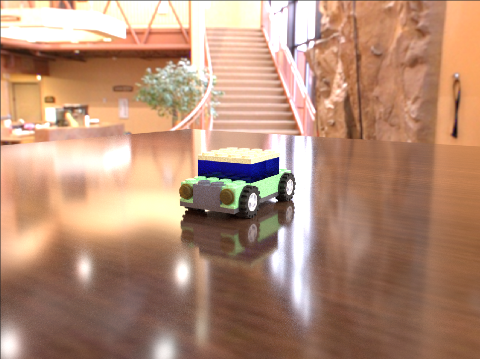
Today we worked on animation, lighting and rendering items making several renders of the same image so that we could see problems in textures and fine tune them as well. I also have a better understanding of how to make constraints and expressions with wheels.

Animation Workshop 3- Squash and Stretch

Image
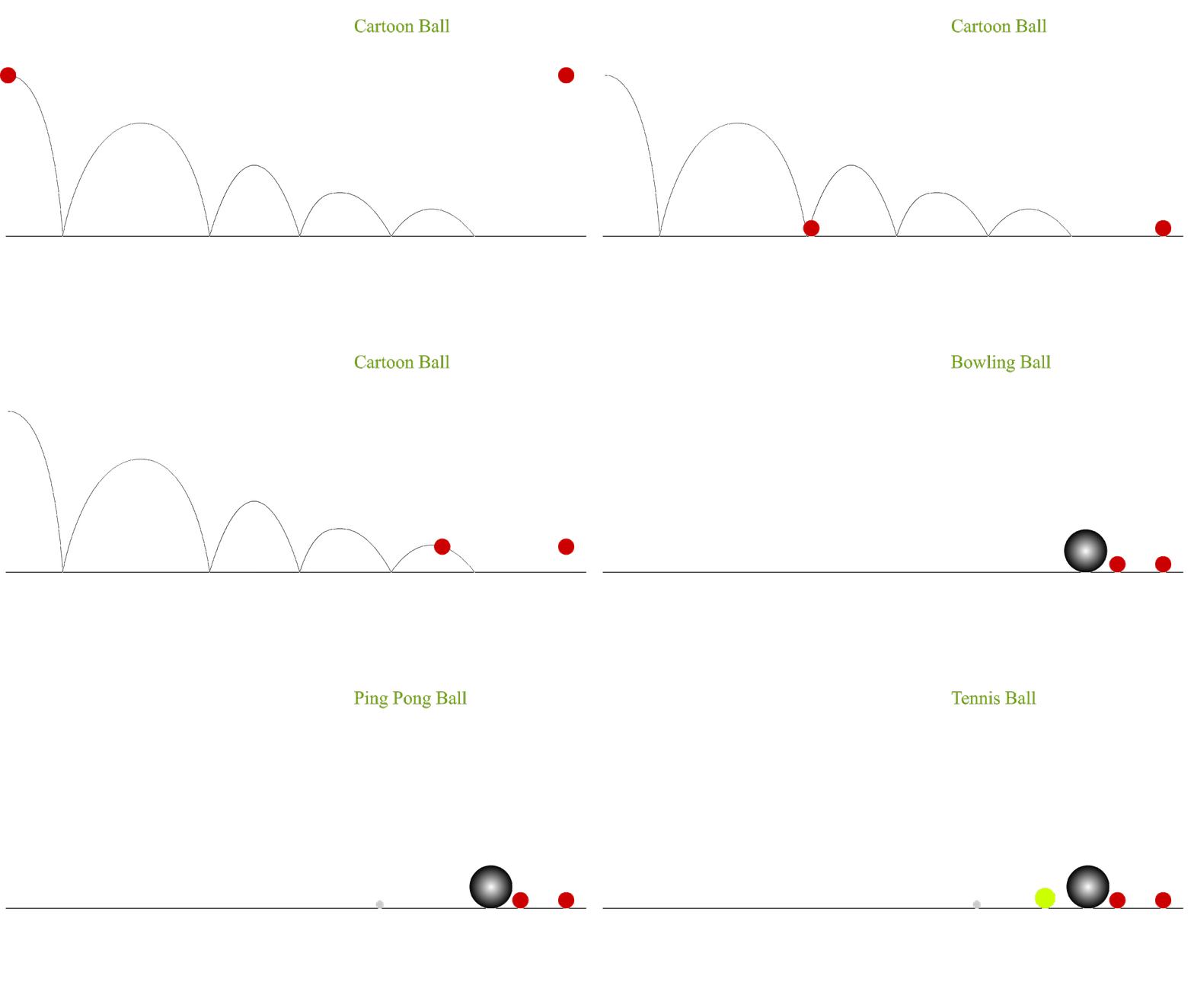
In today's animation exercise we explored one of the fundamentals of animation, being how a figure or shape with Squash and Stretch using it to exaggerate the movement of an object. The exercise also helped give better practice for using arcs to make the jumping of the ball look more natural.

Photoshop Workshop 3

Image
Today in order to help us understand colour and composition and we worked on being vague, mainly blocking and focusing on colour rather than detail. I als

Invisible Cities- Online Greenlight Reveiw

OGR- Jennifer Bricknell by Jennifer Bricknell on Scribd

Metropolis- Film Review

The film Metropolis was made during the period between the first world war and the second world war. Though the film was made before the second world war and the rise of Nazi Germany it has many themes and events that heavily reflect what would happen after the film's creation. A dictator at the top of the shown world in the film, the dehumanisation of people who are perceived as strange or different to the typical people. The film's environment design takes from different kinds of movements depending on the space the film is set in at the time which inspires many films that were made about Nazi Germany after the war. The poorly treated, glum people are put in scenery made to cause a feeling of claustrophobia and an overbearing sense of authority looming over both the characters and the watcher, this is caused by the straight structures and the industrial style of the underground city beneath the metropolis, described by Simon Abrams as   ' strictly utilitarian, its stre

Maya Workshop 3

Image
Today we went through the process of texturing the tutorial car, including going through glass objects and such.  We also worked on rigging a little bit, making an expression so that the car wheels would automatically rotate as the car was moved to prevent extra work being needed to animate for the animate. It took me longer to understand this and I thusly fell behind during the lesson so I will watch and follow the video tutorial in my own time.

Photoshop Workshop 2

Image
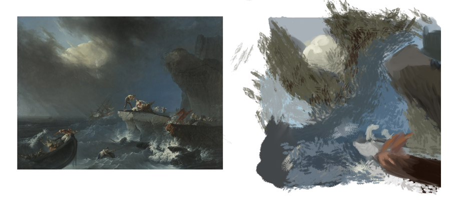
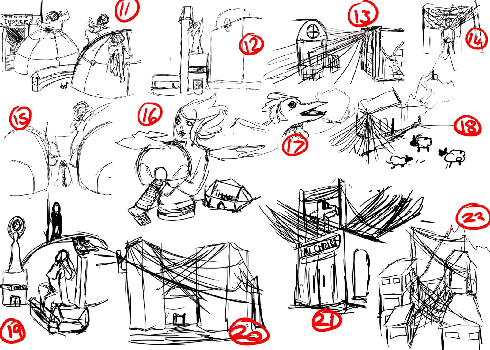
Using photomontage and painting over it in order to make concept art thumbnails, I find this process slower than just sketching however it does present some pleasant, though odd, imagery.  I have also done some more thumbnails from the extracts I have been reading below in sketch format.

Pendulums and Coins- Animation Workshop 2

Image
In today's lesson we looked at arcs and pacing within animation, arcs often have a form to them and a line that guides the object that is following said arc.  Though their spacing is different they all make it to the same place at the same time, this is due to the amount of key frames and markers that are within the animation being the same within each animation, the starting point, mid point and end point are all in the same places. The distance the ball has to travel across the screen is the same in all instances.  The difference between the two coin movements is the illusion it gives, the first coin movement looks like a coin moving from side to side whereas, in my opinion, the second coin looks like its going in more of a circular motion than a linear motion thats suggested in the first coin animation. The markers when closer together give suggestion to a third dimension whereas with even spacing the animation gets no suggestion of a third dimension and remains looking rat

Raphael Lacoste- Research and Analysis (Ongoing)

Image
Raphael Lacoste is a concept artist who was the artistic director for 'Prince of Persia' and 'The Assassin's Creed' franchise. After a while of working with Ubisoft he left, feeling unchallenged by the company and the way he was going with his career. Eventually he'd end up in the film industry taking on the role of a matte painter before becoming a senior concept artist for the films 'Terminator Salvation', 'Death Race' and 'Jupiter Ascending' soon after he became the brand art director of the Assassins Creed franchise. Raphael's educational background includes working in theatre, video, film, media and photography. Whilst studying he'd act in a theatre group known as the Pygmalions. (Image by Raphael Lacoste, Sourced: https://www.artstation.com/raphael-lacoste ) When it comes to his works he uses digital medium to paint, he has two key styles of work most of the time, photo realistic with plenty of detail or simple colours

Contextual Studies 50 Word Story

'Amelia was silent in meditation, under trees, focused on Tenebris; her dead lover. Black engulfed her, not of her closed eyes, it was caused by a void, nothingness, death which had taken Tenebris. Crippling cold in her chest, she burst out screaming. Birds scattered, the earth blackened and Amelia was with Tenebris for short time. As Nothing. Catatonic' This exercise was one meant ot get us to think about the common three part structure in film and storytelling establishing characters, threat and resolution. in this quick writing the sentence 'Amelia was silent in meditation, under trees, focused on Tenebris; her dead lover.' Is the first act establishing characters and their actions before going into the second act with 'Black engulfed her, not of her closed eyes, it was caused by a void, nothingness, death which had taken Tenebris.' establishing threat to the main character. The resolution though not being a pleasant one is established in the final statemen

Lego Car Assignment

Image
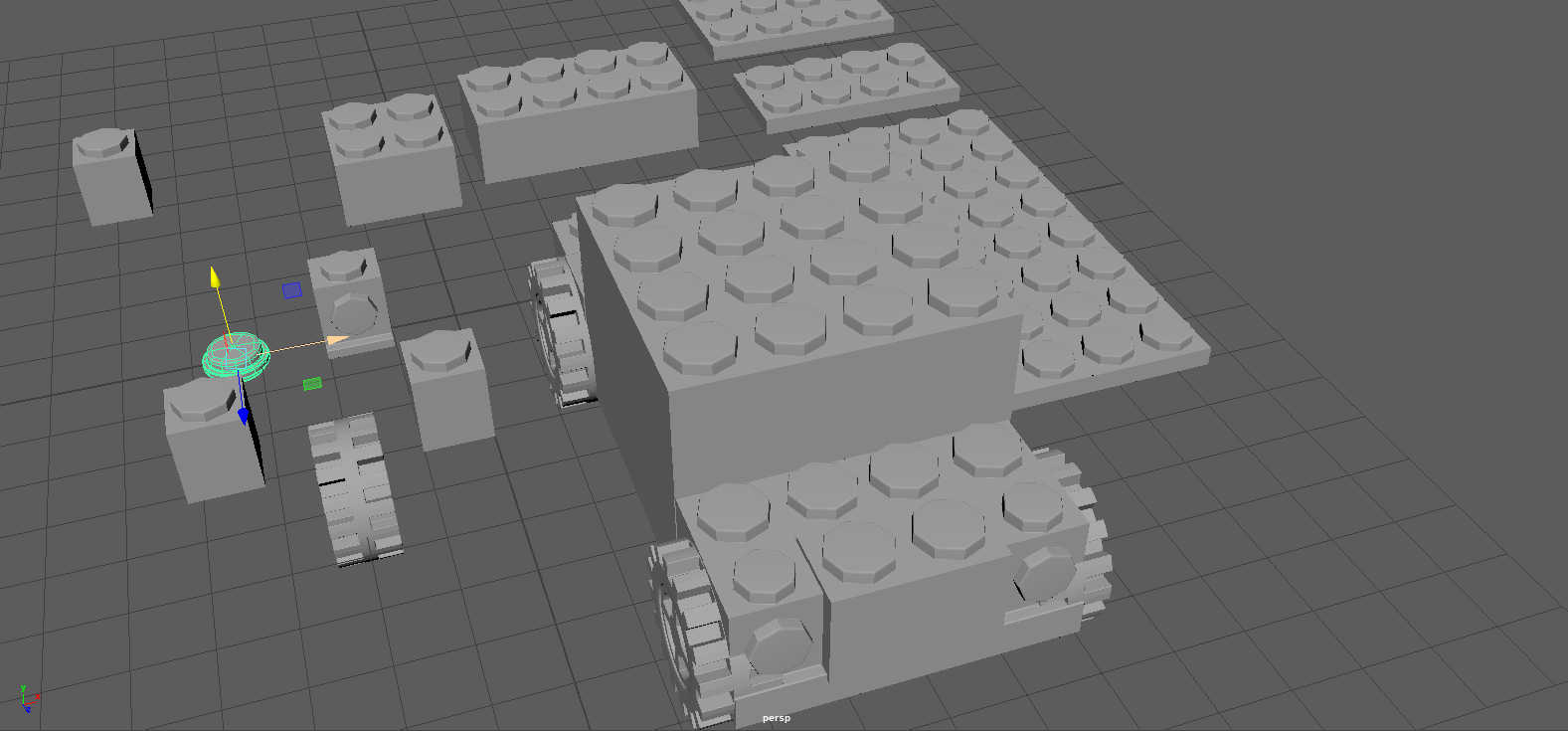
This is one of the cars I have made, to look like a pick-up truck. I need to work on making some more customised blocks for the Delorean due to the vents on the back.

Maya Workshop 2

Image
Today we practiced Mirroring, moving the pivot point, importing and adding assets to structure in order to make a lego car, this weeks assignment is to make a predesigned car out of the assets we have made and have been given as well as a car of our choosing, I am thinking of doing the Delorean from the film 'Back to the Future' or perhaps an Arriva bus.

Morphing Animation Final GIF

Image
This was my work done today after finishing work. That is the GIF from the first animation workshop complete!

Morphing Animation Workshop

Image
Today's work in the animation workshop just one final sequence left to do in the animation which i plan on finishing tommorow afternoon.

Independent Study Day 3

Image
I did a new set of thumbnails for the fifth and sixth extracts from Calvino's anthology, i personally struggled with the sixth extract as the descriptions were rather vague of the cities within the crystal spheres, so I mainly focused on how the creators of said orbs would work around them, some ideas had them set up desks around the orbs and in others the orb was more of a decorative item that the buildings centralised upon.

Independent Study Day 2

Image
My second sheet of thumbnails of cities 3 and 4 of Calvino's anthology given by the brief. I took a favour to the third city, mainly due to the mention of multiple gods which tapped into my interest and love for Greek Mythology. I also practiced more rotation, snapping and moving of objects in Maya creating more variations of the set of blocks I created on tuesday.

The Cabinet of Doctor Caligari- Film Review

The silent film 'The Cabinet of Doctor Caligari' Is an interesting look into the perceived descent into madness. It uses a unique mix of costuming, set painting and design to portray that something isn't completely right, making a feel of disconnection to the watching audience.  The film has clearly inspired filmmakers as a lot of new horror tropes at the time were in this film have spanned out to other films, watching the film you realise where Tim Burton may get a lot of his inspiration for a lot of his films and stories as well as other things with his twist endings which is most prevalent in the stop motion film Coraline as Pheleim O'Neil argues on his article about the film 'the theatrical, expressionistic imagery is a perfect fit and has inspired generations of film-makers to take a less literal approach, and to exploit the visual potential of cinema'(1) as many films these days often do, though some do it better than others. Christopher Sharrett also wr

Block Placement Variations Assignment

Image
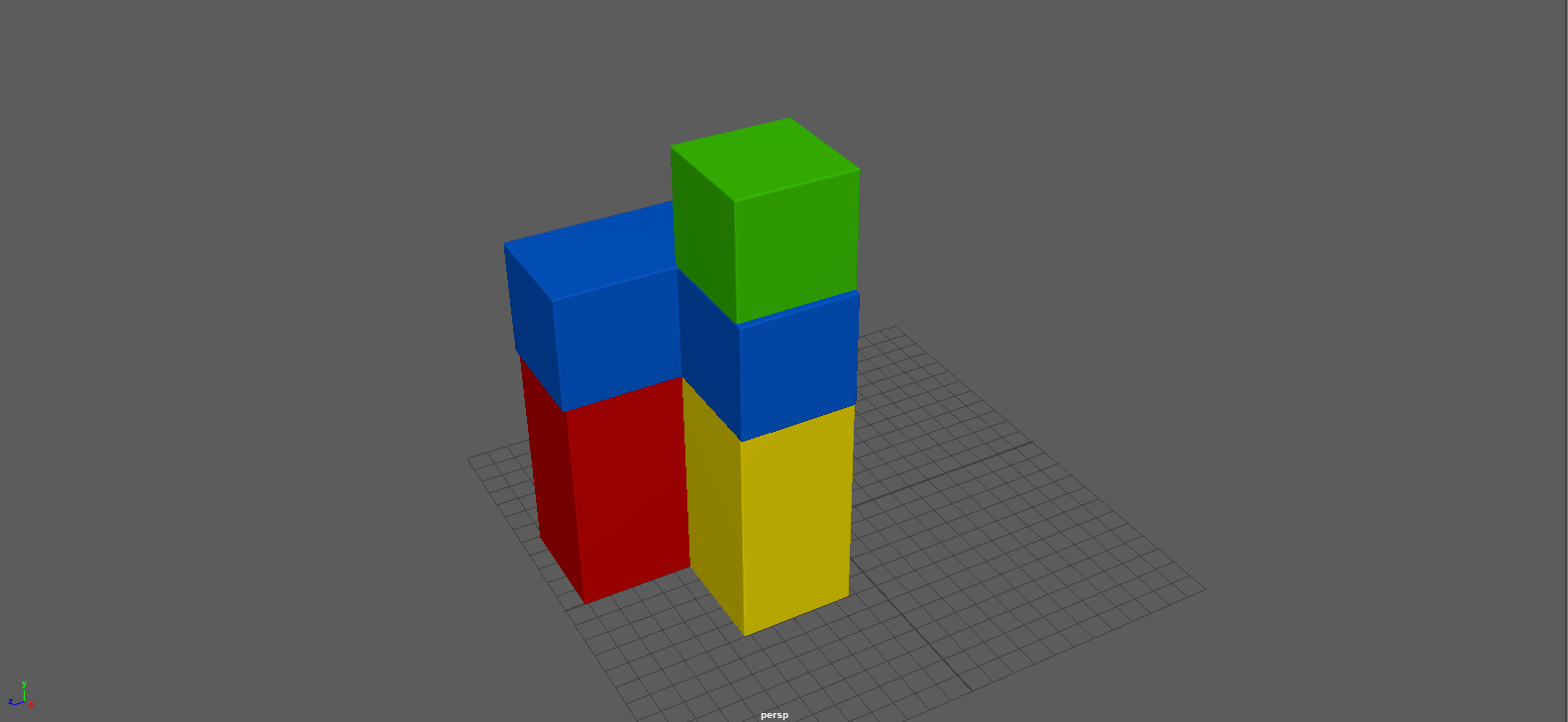
First set of evidence of playing with the placement of the blocks as well as creating new blocks mainly inspired by the Tetris game.